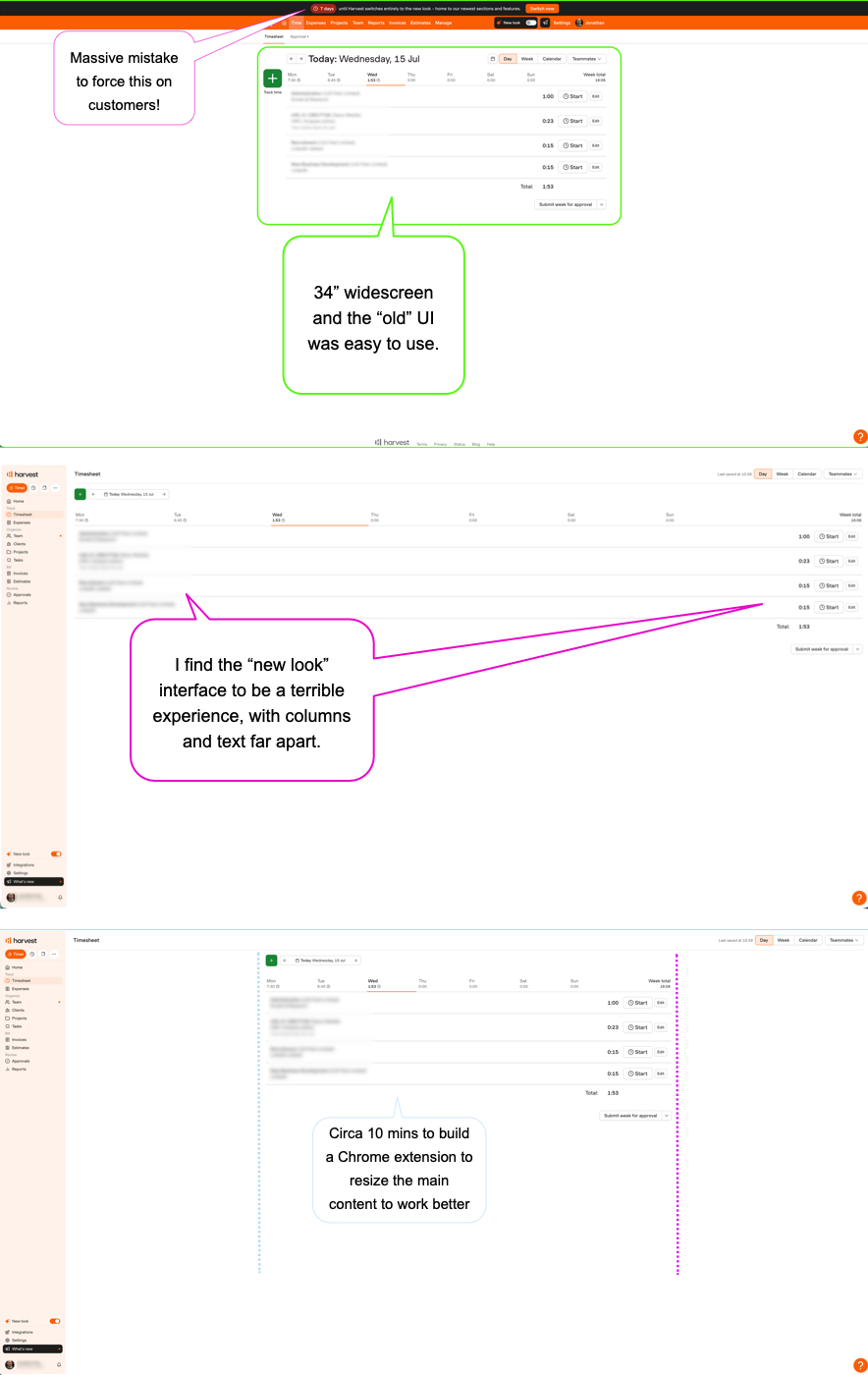
A simple solution to a basic – and vendor ignored – user experience problem
Like many companies, we use a popular tool for logging hours and generating invoices.
The provider introduced a “new look” beta several weeks’ ago and in a few days they will force it upon people.
The new look has a few useful features, but on the whole it’s awful given what I need from it.
You have to wonder if the “new look” was tested given only 1 employee thinks it’s ok.
Why is it bad?
On a widescreen or ultra-widescreen it renders the content across the whole width of the window.
I find this an issue because I often like a window to use the whole screen. But now some content is anchored to the left and some to the right, which can be a few feet apart! This makes for a poor user experience.
I’ve given feedback a few times, but their responses are similar to an IVR brush-off when you’re told “your feedback is really important, but we’re busy right now”.
The fix
Their devs could fix this in a few mins if it was considered important. Maybe, it’s as simple as putting a max-width on their main body container.
Given this isn’t going to happen, for a bit of fun a colleague spent 10 mins building a Chrome extension to resize the nasty UI. Job done!
The risk
This is a trivial issue, but it’s made me think way beyond the “new look”.
So, now I’m wondering with the help of Claude and perhaps a few days’ work, should we consider building our own bespoke 120Feet tool to deliver exactly what I need, with no bloat and only negligible hosting fees?
Feeling ignored may well mean we stop being a customer.